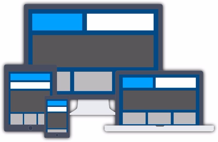
Responsive design, mobile website or dynamic serving? Which to choose?
Google takes very much into account the optimization for mobile devices as a criterion for ranking. This is true to the point that the first search results never correspond to webpages that are not mobile-friendly, especially if the searches are made from mobile devices, which in many cases overtake searches made on desktop devices.
Therefore, it is crucial that the website is responsive so that we can offer the best user experience for all the devices. For this, we have different options:
Responsive design
Responsive design is the most popular option, as we can adapt the site to different devices keeping the same URL and HTML. This is optimal for SEO because it does not generate duplicates and you can keep all the external links within the same URLs, which in turn makes links more prone to have a good ranking. What is more, it is easy to implement because it only uses CSS to provide the different views of the web.
The problem with this design is that it loads all the elements contained in the webpage, which can affect the loading speed on mobile devices. Therefore, it is better to start with the mobile design and from there work on versions for bigger devices.
Independent mobile website
If you choose this option, you will be creating 2 specific sites with different URLs: one for desktop devices and the other one for mobile devices (m.yoursite.com). This option improves the loading speed for mobile devices, as we are creating a specific site for them.
The main problem with this option is that it can seriously affect SEO if the canonical tags are not properly implemented, as we are showing the same content on two different URL (duplicate content). Moreover, the external links will split into the 2 versions, which will make it harder for the main domain to rank.
Another aspect to take into account before creating a specific mobile website is how many devices, like for instance tablets, will be discarded from the adaptable version if they do not fit in any of the devices available.
Dynamic Serving
In this case, the server shows a different HTML and CSS for each device, but keeping the same domain. This makes it possible to create a design optimized for each type of view without affecting SEO.
We could say that this system has the advantages of the two aforementioned options, because we can display different contents optimized for different devices. At the same time, Dynamic Serving can keep the same URL, which avoids content being duplicated and focuses all the web’s authority under a single domain.
The problem with this kind of design is that it is very expensive to implement, because it is very complex to have a system that can flawlessly generate changes in all the versions of the site.
As you can see, each solution has its pros and cons. Therefore, before choosing your design for a web optimized for mobile devices, you should make clear the specific needs that the business needs covering and what its marketing strategy will be. With this in mind, you can create a website adapted to both the public and the budget of the company behind it.


Redacción
Latest posts by Redacción (see all)
- Facebook’s plans to conquer the world - 14 September, 2016
- Analysing organic keyword graphs with SEMrush - 13 September, 2016
- The importance of internal communication - 7 September, 2016
