
Analysing organic keyword graphs with SEMrush
SEMrush includes an interesting tool that allows us to see how the keywords for which a domain ranks evolve through time. The graph will be familiar to anyone who has already used the tool.
The advantage is that we can click on the different ranking groups and see how each group of keywords evolves in time so that we can draw conclusions.
This can be useful to analyse the competition or check out the behaviour of a domain and whether it evolves correctly or as expected.
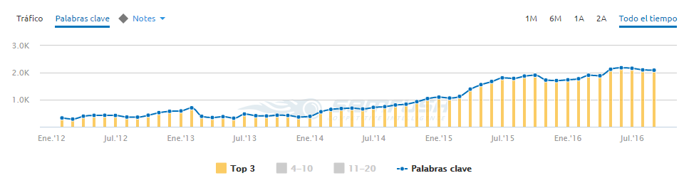
All the graphs correspond to real domains, but references have been deleted so that they cannot be identified. The graph below shows only the Top 3 to see the evolution of the words in this group, but we can mark or unmark any group that we want.
In the following, we will show different examples of graphs with the evolution of the keywords, and we will draw some conclusions for each of them.
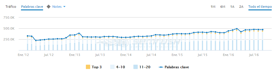
On this graph we see a perfect example of continuous growth at SEO level. The amount of words under the top 3 increases, following a constant pattern without dramatic fluctuations. This is an online store.
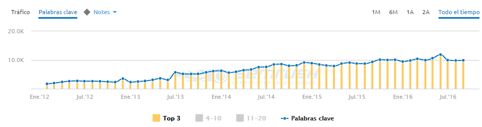
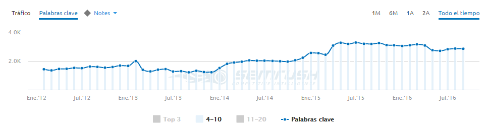
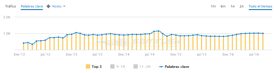
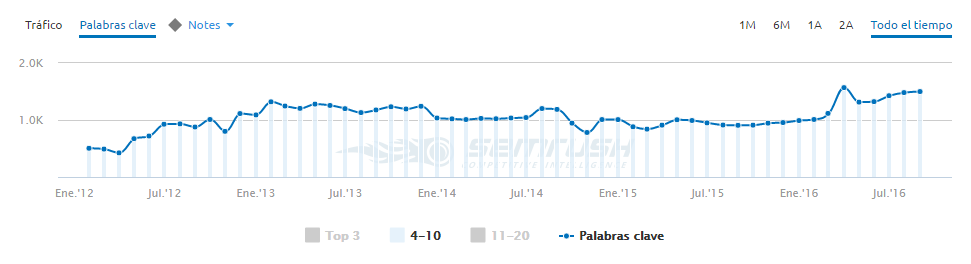
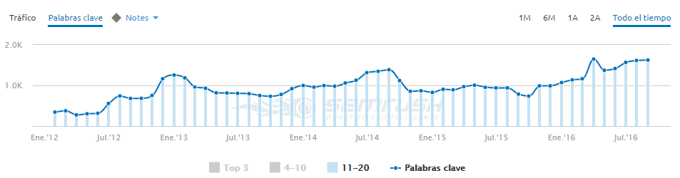
The next two graphs-corresponding to the same domain-show an interesting SEO effect: the increase of words under the Top 3 seems to be caused by many keywords jumping from the Top 4 to 10, a group that does not grow or even decreases slightly.
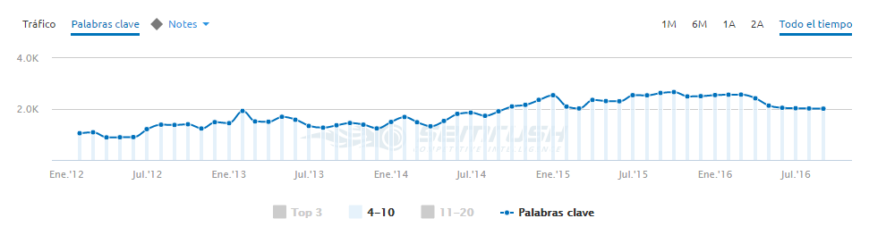
Normally, when we break down one of these graphs in SEMrush, you can see that the 3 groups of words (top 3, 4 to 10 and 11 to 20) normally show a similar trend.
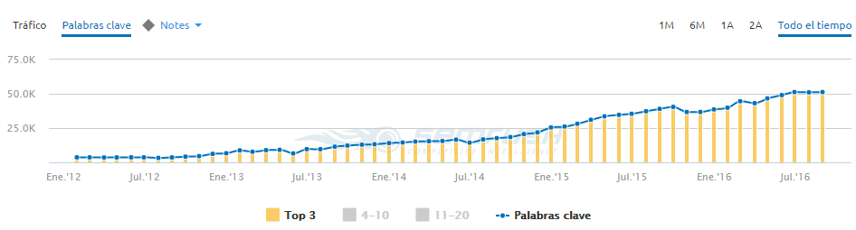
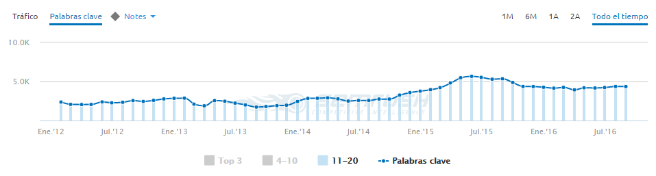
On these three graphs that belong to the same domain we can see another interesting effect, which is that the domain grows due to words that come in directly under the top 3. They do not follow the classical up way path from lower positions. This could mean that very optimized pages are being generated for a specific search.
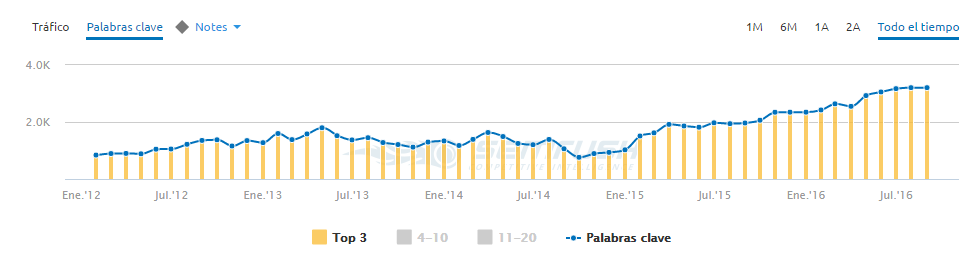
A typical case of SEO evolution are these 3 graphs belonging to the same domain.
You can see that the top 3 shows no changes, but there seems to be an increase in the number of keywords under the top 4 to 10 and those under the top 11 and 20. The next evolution is that part of those which came in under the top 4 to 10 belong afterwards under the first 3 positions.
You have to bear in mind that this was just a quick look. It would be helpful knowing the type of website it is, the possible actions that have been made with SEO influence, the strategy that it is following… And sometimes these data can only be extracted from within the company. The advantage of this kind of graphs is that they can help you explain or analyse if your strategy is feasible.
BTW, the Twitter account of SEMrush normally shares very interesting articles: https://twitter.com/semrush.


Redacción
Latest posts by Redacción (see all)
- Facebook’s plans to conquer the world - 14 September, 2016
- Analysing organic keyword graphs with SEMrush - 13 September, 2016
- The importance of internal communication - 7 September, 2016